Color Matters Blog

Color is always doing something. Sometimes color screams out a message, sometimes it casts a subliminal spell. So, what's happening in the world of color today? Yesterday? Tomorrow? What are the facts, what are the myths?
Jill is the author and designer of the Color Matters website. She's a color consultant who focuses on color psychology and brand identity. See "Who Is Color Matters" at this web site and www.colorcom.com for more information.
JAN
25

Designers that changed everything - and why color matters

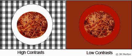
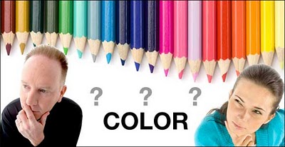
Here’s a look at four successful designs, the artists who created them, and why color matters. I hope it inspires everyone whether you’re an amateur, pro, or just love to dabble.


Gmail logo mess fixed by amateur

gmail icon fix
When it was introduced in October, Gmail’s new logo looked off. The colors looked choppy. Now, thanks to an Evan Blass, an amateur designer, the logo was rebuilt. The new Gmail logo creates an illusion that the colors are overlapping – so blue and yellow make green, and yellow and red make orange. It makes more sense and it’s evidence of the importance of consistency in designing with color.

Covid designer

gmail icon fix
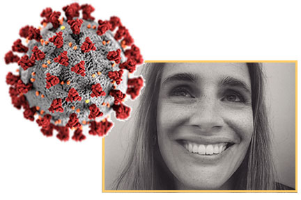
One image defines Covid-19 more than any other. There’s a lot to learn about scientific illustration and color when we look closely at the design and the designer behind the covid image.

Two medical illustrators at the Centers for Disease Control and Prevention (CDC) were assigned the task of creating something dramatic that would catch the public’s attention, a health emergency alert that would pop out of the page. In one weeks time. Designer Alissa Eckert explains that getting the colors to work correctly with the textures took much trial and error. In the end, they resulted in colors that relate to the public health warning aspect.

Her background is inspiring for all of you who are drawn to design: In her fourth year of college as a biology major, she was planning on going to veterinary school. She had taken art classes on the side but had never intended on doing it professionally, until she found out about medical illustration. She found a program at the University of Georgia and ended up at the CDC.

Continue reading
AUG
03

Languages without words: Colors and emojis

The language of emojis is like the language of colors. They both communicate without words. This article compares their powers.


New emojis

emoji new apple

There are more than 2,823 emojis set by the Unicode Consortium and more are coming soon. Apple just announced a preview of those approved earlier this year as part of the Emoji 13.0 release by the Consortium. The dodo bird, piñata, and a ninja are three examples. Which one would you add to your vocabulary?

New colors?

electromag spectrum nanometer 24

The normal human eye can theoretically distinguish 7.5 and 10 million hues. New pigments, such as YinMn Blue, have been discovered. Also, Pantone and paint manufacturing companies frequently add new color swatches to their collections.

On the other hand, it’s scientifically impossible that a human being might see a color that’s never existed before. Our eyes can only see a specific portion of the electromagnetic spectrum because the visible colors on planet Earth originate from the light emitted by the sun. More information here and from Wikipedia.

If humans could visit a planet around another star - and depending on that star's color and the conditions of the planet’s atmosphere - a new world of color could be revealed. There’s also the possibility that evolutionary changes in human eyes will allow us to see broader areas of the light spectrum, in which case the brain will interpret this new information as a new color.

Continue reading
OCT
18

The Colors of the Year 2020

The breaking news about all the "Colors of the Year 2020".

"First Light" – Benjamin Moore

COTY Benjamin Moore First Light

“First Light” (2102-70) is Benjamin Moore's "Color of the Year 2020". It’s a soft airy hue – not too sweet. The brand describes it as “a backdrop for a bright new decade”. Worth noting is that pink has become more of a mainstream color thanks to Millennial Pink. In this case, you might consider “First Light” as the new white. It’s blooming with potential!


"Naval" – Sherwin Williams

COTY Sherwin Williams Naval

"Naval" (SW 6244) is Sherwin Williams’ "Color of the Year 2020". It brings navy blue into a new era. The company describes it as a deep shade that “fuses the striking and bold opulence of Art Deco with the awe‐inspiring power of nature”. Naval was designed to do just that, inspiring a sense of "restfulness and tranquility" in one's home, according to a press release.


"Back to Nature" – Behr

COTY BEHR Back to Nature

Behr released “Back to Nature” as its "Color of the Year 2020" in mid- August. It’s a meadow-inspired light green hue that the brand describes as "calm, gracious, and balanced, and a way to bring the outside in.” Look closely at this complex color. It’s a very subdued olive green. Murky and peaceful.

Continue reading
OCT
18

Test your color imagination

Have some fun and test your imagination.

Assume that each of these two colors will be “The Color of the Year”. The challenge is to reinvent the color by giving it an evocative new name. You might even consider giving it a name that embodies a sense of calm.

#1 A light pink

pink paint

The first color is a very light pink. Delicate and sheer. It’s floral like the palest pink roses; it’s sweet like the frosting on cupcakes, comforting like a stuffed bunny from childhood, and as feminine as ballet shoes.

4 pink things

If you had to reinvent this pink with a name that would get rid of all these associations – and have mass appeal – what would you name it?

Consider this: Some paint brands have named this tender hue “Pink Ground” or “Calamine” (Farrow & Ball), an almost identical color “Almost Pink” (Glidden), “Paris Pink (Portola Paints), “Pink Bliss” (Benjamin Moore), “Pink Elephant" (Behr), and coincidentally “Elephant Pink” (Benjamin Moore).

Pause for a moment. Use your imagination! It’s your turn to name it.


 Conclusion: Benjamin Moore has named this light pink “First light” - and it's "The Color of the Year 2020".

Pink First Light

If ever there were a way for pink to shed its sweet, floral, and child-like associations, this does it. On the other hand, what is the color of first light? If you google it you’ll find images like the one below: In any event, it’s all in the name and this one is genius.

Here’s how it looks in the context of nature:

First light in nature


 #2 - A subtle green

green paint

This is a tricky one. It’s a very subdued light green. Sage? Or perhaps the color of a cooked artichoke or a murky swamp? It’s definitely earthy.

Continue reading
MAY
30

The Most Expensive Color in the World

Google "the most expensive color in the world" and you’ll get a lot of information about diamonds. For example, a blue diamond that sold for $32 million and that red diamonds are the rarest and most expensive.

Google "the most expensive pigment" and you’ll find that Lapis Lazuli is believed to be the most expensive pigment ever created. It was pricier than its weight in gold.

lapis lazuli
From the essay, "Blue," in Alexander Theroux's "The Primary Colors" -
Blue was always the most expensive pigment for painters, first of all, for supernatural beauty, perfection, and glory. The goldlike flecks of pyrite crystals in lapis lazuli have often been compared to stars in the sky.

Google “the most expensive paint in the world” and you’ll get a lot of information about paintings such as Da Vinci’s Salvator Mundi that sold for $450 million. You might even see an ad for marine bottom paint that sells for over $1000 for a 3-gallon can.
YlnMn blue

There's also YinMn Blue - a brilliant blue that was accidentally discovered 10 years ago. Unfortunately it appears that many paint manufacturers – such as Shepherd –are interested in the pigment and will be bringing paints to market after commercialization.

And that brings us back to this question about colors that you can buy today:

The most expensive paint color?

Farrow and Ball paint

Continue reading
JAN
26

Color Trends for 2018

trend blog banner crystal ball

"Color trends for 2018" is a challenging topic because there are trends that emerge from mass culture - and are frequently fed by media - and there are the "Color of the Year” proclamations that arise from the big business of trend forecasting.  In the first case, there’s no time limit; in the latter, it’s specific to the year. Above all else, trends get us to look at color in a new way.

Continue reading
FEB
23

Something New to Pink About?

Pink has been all over the news recently. Some of it is powerful and inspiring but the same old dirty little lies about pink continue to be spread. We begin with color news you can’t use:

Liar Liar – The Color Wheel Is on Fire
(The same old nasty alternative facts about pink)
Cool Down Pink

pink jail

The article states: "Are you quick-tempered? Have bouts of aggression? The reason could be lack of pink in your environment! According to psychologist Daniela Spath a certain shade of pink calms the nerves, including in aggressive prisoners."

Continue reading
Tags:
AUG
15

It’s not easy being lurid green

lurid green

Continue reading
MAY
08

The Color of Insanity

insanity color blog

Typically people ask about the color of happiness, power, and other positive attributes. When a former student asked about the color of insanity, it deserved an answer. Here are a few things to ponder:

Continue reading
SEP
12

Shoes and Hues

Red sole Louboutin shoes & neon yellow-green Nike Volt shoes

The power of the color of shoes made the news recently – and it left a historic mark on women's fashion and athletic gear.

Christian Louboutin just won trademark protection for its women's shoes with red soles while an appeals court also ruled the company can't trademark a design that is simply all red. In other words, they have exclusive rights to use the color red on the inner soles of their high-heeled shoes. It's like Tiffany's blue box and Cadbury's purple packaging — the red sole has been an iconic signature for these designer shoes for 20 years and they have the legal rights to it. Source

Continue reading
AUG
01

Pink: The Color of Shock and Awe - Olympics 2012

Olympics 2012 Pink ticket
A Guide to Color Symbolism from the author of Color Matters

How daring! The official color of the 2012 Olympics is pink. Maybe we can finally see beyond the stereotype and consider the many personalities of this compassionate color.

Continue reading
APR
23

Color Criminals - Red Gets Busted

starbucks bug juice red - cochineal
Wild salmon and farm raised salmon with colorants


Bug juice “red” made the news when it was exposed as Starbuck’s food coloring used in strawberry frapuccinos. After a public outcry – even from non-vegetarians – Starbucks announced it has stopped using it.

Continue reading
FEB
09

At the Heart of Valentines Day

Heart Attaq painting by Jill Morton
Heart shaped Coin, Cyrene 600 BC

Continue reading
DEC
06

Is color the key to weight loss?

Color contrasts of food and plates
Color plates experiment - Servings in ounces
The worst plate colors for different kinds of food
Blue plates curb appetite
Garish color can curb appetite
Color Consultation for Marketing & Branding in the Food Industry

Can colors curb your appetite and help you lose weight? Maybe. Could the color of a plate be a key to weight loss? A recent study says, “Yes.”

Continue reading
NOV
08

Addicted to Color

Addictions - Candy, Exercise, Color

Continue reading
OCT
25

The Colors of Fright! Black, Orange, and White

The colors of fright

We can be green with envy, turn purple with rage, see red, and feel blue.  But what about fright? What’s the color of fear? And for that matter, what about the colors of Halloween?

Continue reading
APR
26

In the future, every color will be world-famous for 15 minutes

Andy Warhol - a master of color
Continue reading
MAR
30

A Color that’s Worth $80,000,000

If you've ever wondered if color can make a multi-million dollar difference, check out this example of a special shade of blue.

Continue reading
MAR
16

Working with Color: Bailouts and Branding

Which color is the best for a product?

I love interviews with the press because there’s always one challenging question that requires a good answer. Last week, the interviewer asked, “How do you get your color consultation projects?” I replied that half the time, there’s a color disaster underway and someone contacts me. Typically, “the boss” has chosen his or her favorite color for the logo (or the product, packaging, etc.) and a member of the staff senses that there is something terribly wrong with the choice.

Continue reading
FEB
24

When is a color racially offensive?

Racial Insensitivity - Colors 

The recent controversy surrounding the aboriginal costumes worn by Russian ice dancers Domnina and Shabalin raises questions of cultural theft, authenticity of the steps, and appropriate costumes. Some Australian aboriginal leaders have claimed that the pair’s brown-toned costumes adorned with leaves and white aboriginal-style markings were offensive and far from authentic. On the other hand, the Russian duo’s coach explained that the term "aboriginal" translates from Latin language and means "from the beginning" and that they tried to represent a picture of the time when aboriginal people were in the world - with no reference to any country or custom. Nevertheless, in spite of changing the hue of their original costumes from a dark brown (intended to make their skins look darker) to a paler shade, which better matched the Russians' natural skin tone, the controversy still rages.

Continue reading
FEB
12

There’s More Than Love at the Heart of Red

red-fuchsia

"Monkey Butt Red" and "Flaming Fuchsia" made the news recently - at least in the automotive industry. These are the names of colors created by Toyota and Dodge for the debut of their elite sports cars. Consider the possibility that these colors and their names were intended to generate a lot of press.

Continue reading
FEB
03

Shattering a Colorblind View of the Past

Dinosaur and Archer

For nearly two centuries, scholars have been arguing that beige and white were not the true colors of antiquity. The Parthenon in Athens and the Forum in Rome might have been almost gaudy. Unfortunately, such ideas have never influenced Hollywood or many experts. For example, in "Gladiator," when Russell Crowe strides down the streets of ancient Rome, circa A.D. 180, he's backed up by the proper complement of white marble. In almost every view of the past, textbooks included, the ancient world comes off as monochrome.

Continue reading
JAN
12

Color Karma for the Next Decade

Crystal Ball Color Karma

Where will color go in 2010? What about the next decade? Will we be under the influence of trends or will the timeless powers of color rule? I’m sure you’ll agree that it will be both - and it all depends on many factors. The good thing about trends is that they inject new life into the color wheel. Yes, but what goes around comes around again and that’s my first take on color karma for the next decade.

Continue reading
NOV
27

Push the color red as far as it can go?

Chris Chou Mandala

One of my unfulfilled dreams as a colorist has been to pack as many colors as possible into a painting that breaks the barrier of “it’s too pretty to be considered as serious art.”

When I was working on my M.F.A., the "anti-aesthetic" ruled. The art that was sanctioned by the intelligentsia was far from lovely. Matisse’s famous philosophy - that a painting should be like a comfortable armchair - was taboo. There was no going back to the luxurious color harmonies of Matisse and Monet in the French impressionist era or the lush abstractions of deKooning or Rothko in the mid-twentieth century.

Continue reading
NOV
04

Here comes trouble: Paint matching apps for the iPhone

iPhone-banner

It’s supposed to solve the dilemma of winding up with all those cans of paint in colors that are too bold, too dingy, or not quite right. Both Benjamin Moore's Ben Color Capture and Sherwin-Williams' ColorSnap applications for the iPhone work the same way: Take a picture with your iPhone, zoom in on an area of color that you want to match in paint. Click “match” and the application gives you a range of paint options just like a real paint strip from their catalogue (either Moore or Sherwin). On the plus side, it shows the color’s nearest neighbors, in both lighter and darker shades.

Continue reading
OCT
27

A Color Heaven

Bermuda
Three weeks ago, I presented a seminar about color in Bermuda. I’ll admit that I’m quite spoiled by living in the color paradise of Hawaii. I’m not easily swept off my feet, but the colors of Bermuda - everything from sand to architecture - were stunning and classy, at that.

Real men wear pink - pink shirts and even pink shorts. In fact the logo on the airport terminal is a pair of pink Bermuda shorts. Aside from wearing apparel, many of the beaches are pink and so are the homes and many of the commercial buildings.

Continue reading
OCT
14

Monkey Butt Red?

Monkey Butt Red

It’s the new red … and it’s the color Toyota chose for the FT-86 sports car. Yes, it really is the red color of a Japanese monkey’s backside and if you can pronounce it, it’s “shoujyouhi” red.

Just when we’re getting used to a new genre of creative – but not always descriptive - color terms, such as "Fiji Weegee Fawn" for nail polish, "Freedom Trail" for paint, and "Peter Pan" for candles, Toyota's reference point for this new hue is beyond bizarre.

Continue reading
SEP
10

Liar, Liar, the Color Wheel is on Fire


Too-Many-Colors

Does the web provide an open door for "color experts" to dish out bad advice? Maybe in the dark days before the web, the color wheel was on fire but no one could see it. Whatever the case may be - and on the heels of last week’s Benjamin Moore report - there’s a new one.

The latest bad advice is based on the assumption that the "old rules" about how to use and combine colors are out the window. Here’s the exact quote from an interior design professional:

Continue reading
SEP
09

Busted! What is the color of trustworthy information?

Color inside brains


Wikipedia just announced that they will allow a color-coding for text that has been declared untrustworthy. Orange will be used to highlight unreliable text, with more reliable text given a lighter shade. Text earns "trust" over time, and moves from orange to white.

Continue reading
AUG
20

In Memoriam: Kodachrome and Polaroid

Poladroid 

2009 marks the end of two photographic wonders and the amazing colors they produced. Digital photography has rendered them obsolete.

In June, Eastman Kodak company announced that its Kodachrome film would be no more. This was the slide film that gave us such beautiful bright colors and it's the film Paul Simon idolized in the classic line of a song, "Mama don't take my Kodachrome away."

Continue reading
AUG
04

Wet Dog

Wet Dog

wet dogs

When I was in art school, a professor commented that my painting looked like a soggy dog. That was a compliment! I was struggling to find my artistic center and had poured turpentine on an oil painting (still wet and workable) and saved the results.

Continue reading
JUL
27

Color Infringement: Microsoft vs. Google

Chrome vs Windows color logo

Lawyers for Microsoft, Inc. have filed a lawsuit against Google, claiming the company's new Chrome OS color scheme infringes on the Windows logo color scheme.

Continue reading
JUL
17

Changing the Colors of GM's Logo

GM Logo

It was rumored that GM may consider changing the color of its logo from blue to green when it emerged from bankruptcy. Apparently, that’s not going to happen.

Continue reading
JUL
10

Hues that cry for freedom

Hues that cry for freedom

colors of revolution 

Green is the color that is still at the forefront of demonstrations in Iran and across the world in protest of Mahmoud Ahmadinejad's controversial victory in June's presidential elections.

Continue reading
JUN
25

A new identity for green

Green protest Iran

Green has emerged as the color of protest in Iran. The pictures describe more than any words in this blog. (Note: Green is the signature color of Mir Hossain Mousavi, the main rival of President Ahmadinejad in the Iranian elections.)

Continue reading
JUN
11

Color Hall of Shame: The Tragic State of Research on Color Effects

Thirty years of research on individual reactions to colors in the environment has produced contradictory findings. Some research has concluded that people who can "screen out" irrelevant information in their environment are not easily stressed out (or aroused) by warm colors such as pale orange walls, whereas "low-screeners" are more aroused by the same orange walls.

Continue reading
MAY
26

A Close Encounter with Yellow

yellow-dress-bus

I usually don’t write about my personal experiences with color but a recent encounter with a startling yellow dress is worth the space on this blog. In fact, the dress was such a bright yellow that I felt like kids might try to ride me to school. Okay, it’s a cliche, but school bus yellow is a color that can really be too overwhelming for my fair coloring. Soft creamy banana yellow is okay, but not mango yellow.

Continue reading
MAY
18

Dyeing for Color

dye-lawn

Restoring Color to Dead Lawns of Abandoned Homes

Foreclosed homes with dead, brown lawns can be found in just about every neighborhood these days. Apparently a business in California is waving a magic wand of green paint over the lawns and dressing up the properties. The water-based paint is chemical free and includes flower-based pigments.

Continue reading
MAY
08

Where the Oceans Meet the Mountains

WindStorm mountains and waves 

It’s green but it seems blue. Or does it? The Storm King Wavefield is a permanent installation by Maya Lin in Mountainville, N.Y. Seven parallel rows of rolling, swelling peaks on 11 acres were inspired by the forms of midocean waves but echo the mountains and hills around them. It’s made of natural materials: dirt and grass.

Continue reading
APR
27

Finding Color in a Parking Garage

ft worth-park 

Every once in a while you find an example of architectural color that goes beyond the blah beigeness of contemporary design. This time, it’s a Public Art project in Fort Worth, Texas.

Continue reading
APR
14

Is Black Green?

black-good-bad
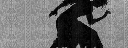
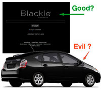
Black was the center of two disputes about its eco-friendliness. In one black was perhaps good; in the other, bad. You can be the color judge.

Good Black

The first case was Google’s "Blackle" - an alternative to Google's white page - that would save 3000MWh per year. Others claimed that "While it may be true that a CRT monitor uses 15 watts less with the black screen, only 25% of the world's monitors are CRT." Some others put this to a test of 27 monitors ("The Final Test") and found that LCD monitors with a size 22-inches or less, all showed an increase in power consumption using Blackle. Beyond the 22-inch mark however, five of the six models showed a fractional decrease in power consumption when using Blackle.

Continue reading
MAR
30

The Evolution of Color Symbolism

yellow-3-blog

Our responses to color are inherited and learned. My experiences in Pakistan reconfirmed the reality of both universal color symbolism (timeless) and all the other kinds of meanings that evolve over time (religious, geographic, political, gender-based, etc.)

Continue reading
JAN
20

Color Trends in 2009


The Color of the Year 2009
Thursday, January 01, 2009

2009 Color Wheel

 
Although the color czars are dictating the color that a specific color will be "THE COLOR of 2009" (come back to this blog in a few days for details), we suggest a color bailout. Or maybe we should call a moratorium on all trends. The last thing we need as we enter a new year challenged by severe economic and environmental realities is a color that will promote us to consume more. Isn’t that what any trend evokes?

Continue reading
JAN
09

Color in Pakistan

Color: Bringing the World Closer Together
Tuesday, January 27, 2009

haw pak map-72 

During the past decade on the Internet, I’ve realized that color is an experience that we all share regardless of politics, religion, geography, age, or gender. Over 6 billion people are on the planet – and we are all immersed in a color soaked world.

Continue reading
DEC
30

December 2008

Blue is the car color of tomorrow
Monday, December 01, 2008

blue car shoes
 

It’s blue again! It’s the favorite color of people all around the globe and even though we may adore it and wear it, how many people want a "true blue" car?

Automotive paint supplier PPG Industries Inc. issued its annual forecast and predicts that blues (particularly more vibrant, richer, complex blues) will take on a more important role in car styling.

Continue reading
OCT
31

Fall 2008

Better than Autumn Leaves?
September 1, 2008

Purple Lake


Here’s an environmental delight for the eyes and maybe an itinerary for a colorful vacation:

The 25 Most Colorful Lakes on Earth

It includes photos and information about:
1. Turquoise and Blue Lakes
2. Green and Yellow Lakes
3. Purple and Red Lakes
4. Sunset Lakes

Continue reading
APR
21

Blog 2008 -Part 2


Here are some Blog entries from April - June,  2008

See the Blog Menu at the left for a full list of all the blog articles.

Blog Archives 2: April - May  2008

Gagging on Green?
April 6, 2008

With the arrival of spring in the Northern Hemisphere, delicate and dramatic shades of green are everywhere. This reinforces our awareness of the environment and the latest news about "green" (ecologically beneficial) products and efforts. It almost seems that any opposition to the color green could be deemed anti-earth. Just for the fun of it, let's put this on pause and play with the unappetizing attributes of green. For example, "split pea" green can sicken the viewer. Bright green may be acceptable as Astroturf, but what about green as in "sleazy motel carpet"? Just for the record, green (with a yellowish cast) is not a good color in situations where motion sickness can occur such as the interiors of passenger trains, planes, and boats.

Continue reading
JAN
01

Blog 2008 -Part 1

Here are several Blog entries from 2008

Blog Archives 1: January - March 2008

When is a Color Hideous?
February 26, 2008

Yes, we all have strong feelings about color. When American Idol's Simon declared that contestant Chikezie's orange suit was hideous, I was shocked. I've never heard anyone declare a color "hideous" - and even more appalling, it was said in front of an audience of 29 million people. In the days that followed, I began to think about the larger issues: Why does a color work and why doesn't it work? Is it really all about personal reactions and color stereotypes - or is there more to it than meets the eye?

Continue reading
SEP
01

Blog 2007

Here are two archived Blog entries from 2007

Global Color Matters - Yellow

alt


Color-coded ribbons show our support for a wide range of causes. For example, the yellow ribbon demonstrates support for troops in the U.S. It's also used for suicide prevention, adoptive parents, bladder cancer, spina bifida, and amber alerts.

Continue reading

Subscribe to the free Color Matters Newsletter

Color Matters is a registered trademark of J.L. Morton.
Graphics and Text: Copyright (c) 1995-2024, J.L.Morton, All rights reserved

copyscape seal blue 120x100